
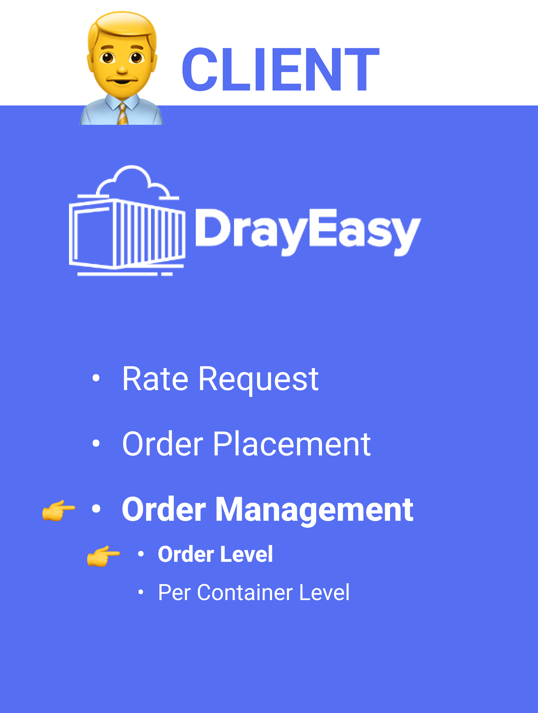
Platform for Global Logistics
An upgrade of a drayage service that empowers freight forwarders to fully control their orders. Collaborated with DrayEasy Inc., launched in September 2023.
Time
May - July 2023
Team
Shuyao Xiao, Henry Huang, Yuwei Zhu, Dora Wang
Contribution
Research, UX design, Design System
IMPACT

1 Page
Reduce
to streamline conversion process by combining Order and Pre-order Page
1 Step
Simplify
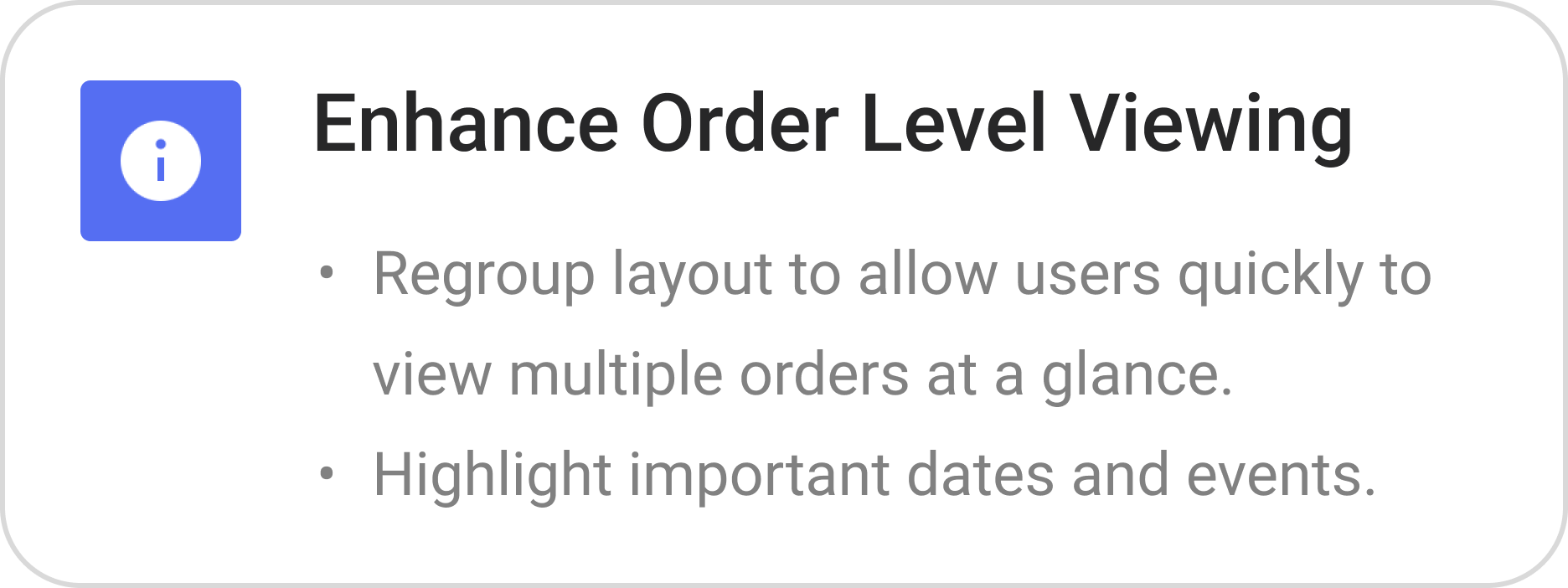
to track a specific container by incorporating nested table

15 Seconds
Save
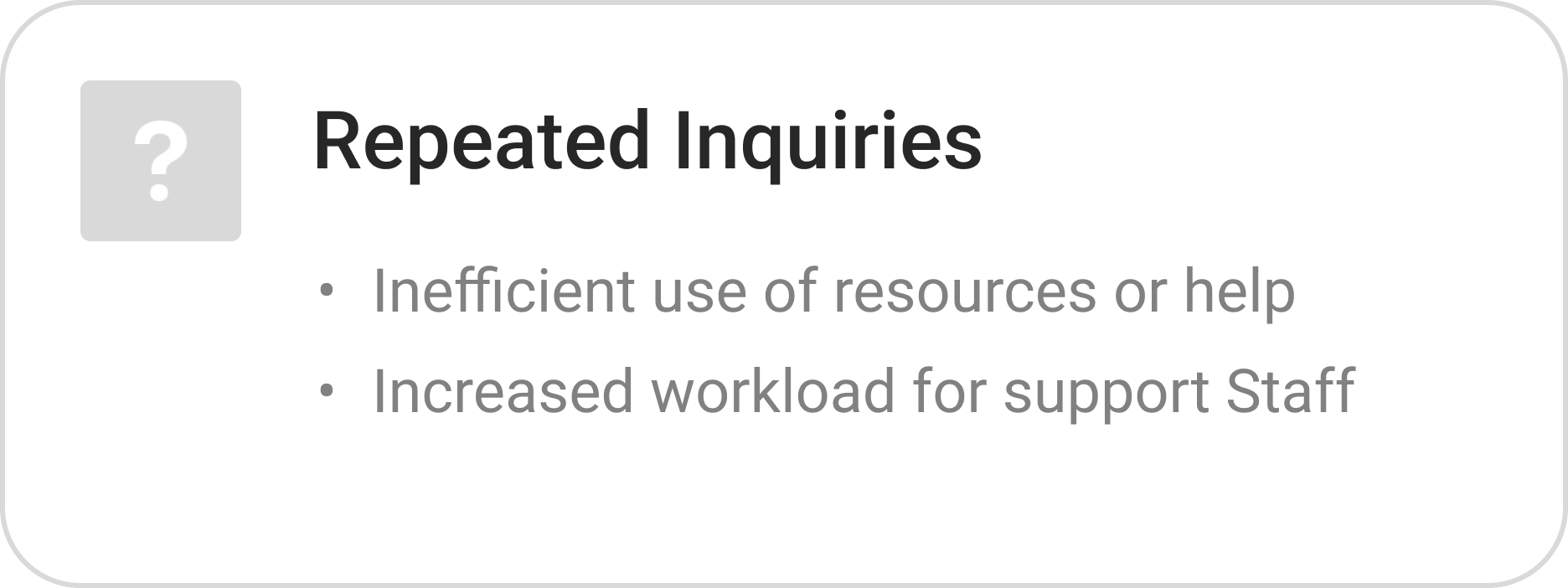
to contact Drayeasy for help by adding FAQs and chat box
BACGROUND
A drayage is a form of trucking service that connects the different modes of shipping, such as ocean freight or air freight. It's a short-haul trip that transports goods from one place to another, usually before or after its long-haul shipping process.
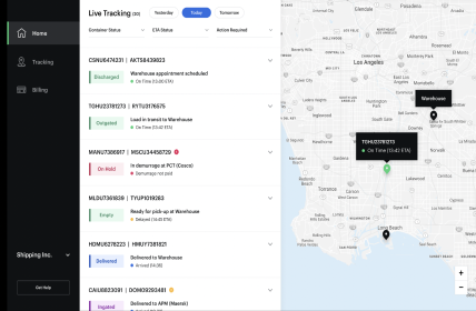
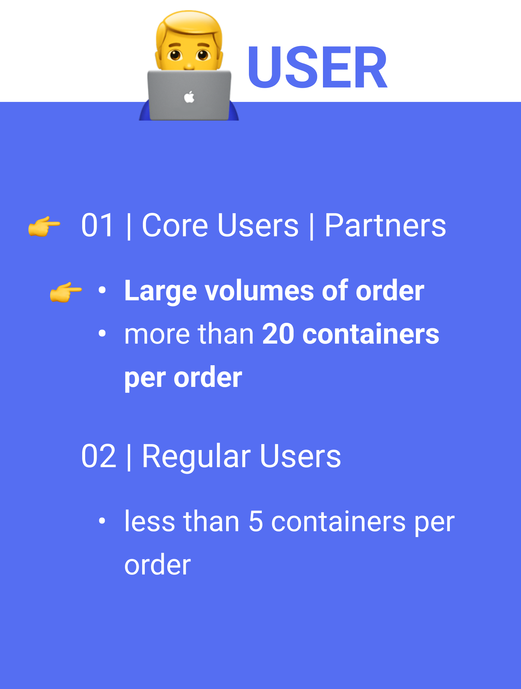
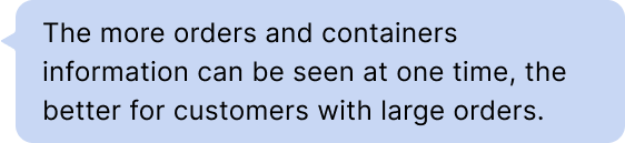
Search, sort, filter, and track large volumes of orders and containers.
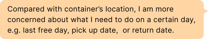
Quickly identify actions that need to be taken.
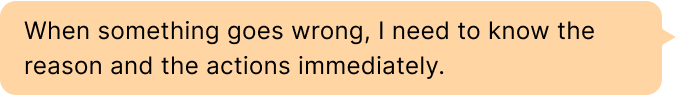
Reach out to Drayeasy when an issue arises.
GOAL
How might we integrate massive order information into the user portal to improve shipment visibility so users can feel controllable and reliable?

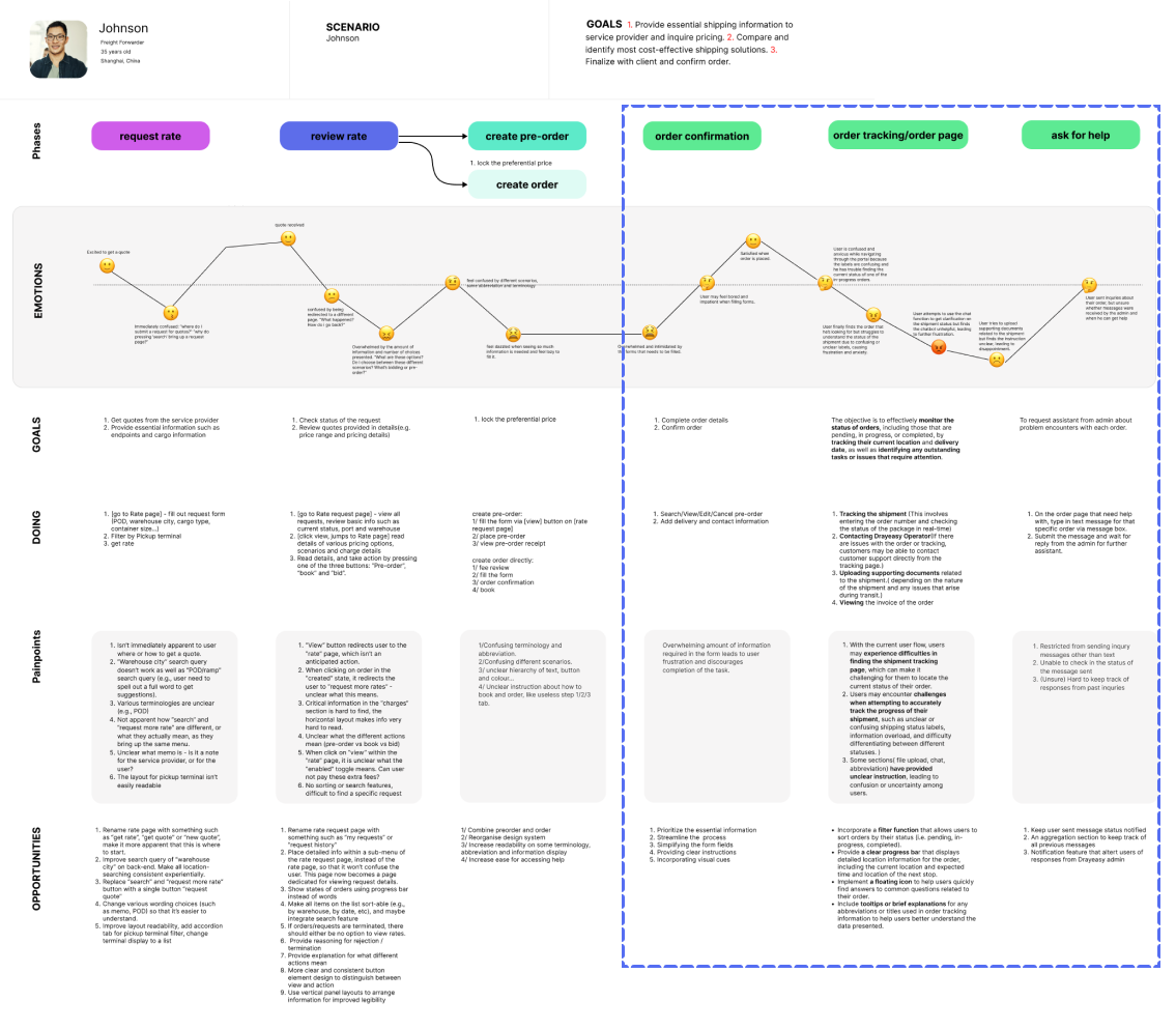
Insight 1
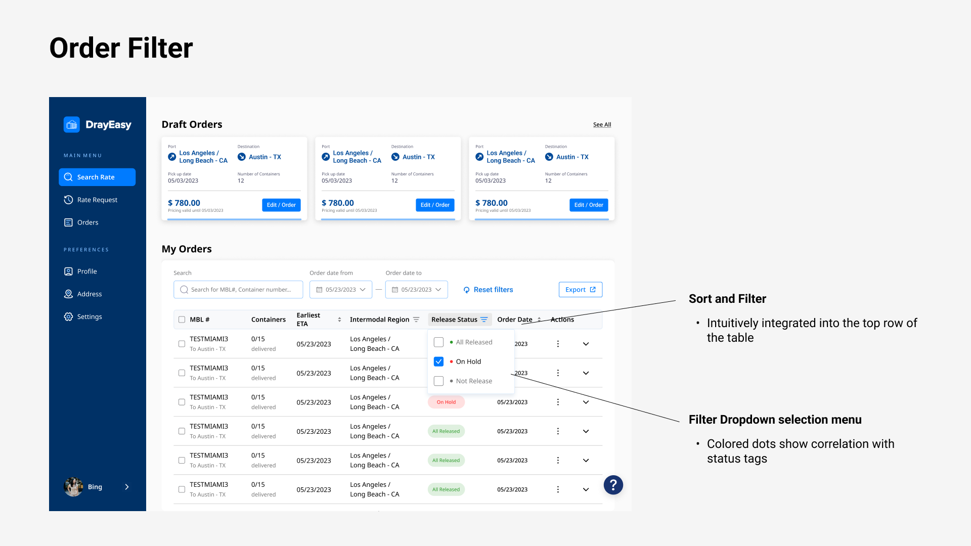
Order status labels with colors provide users with a concise and clear summary of their shipment's progress.

Organized
DEFINE PROBLEM
Product Critique


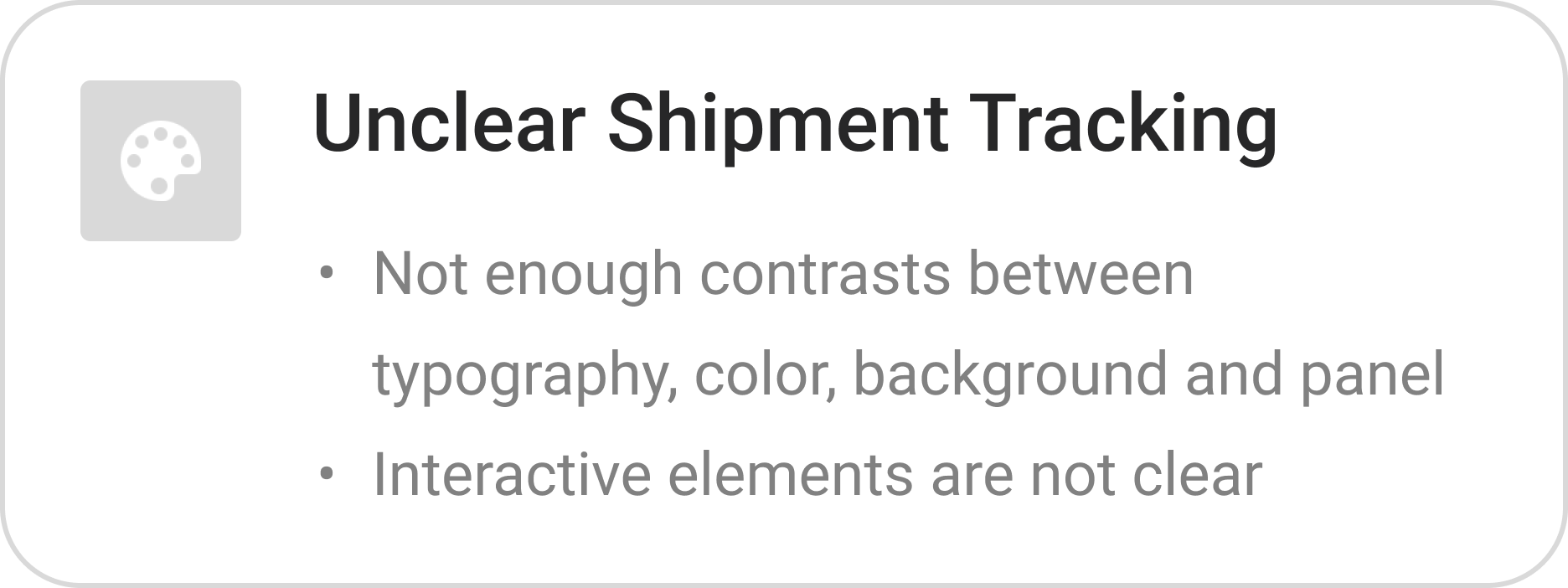
01 Frustrating information architecture
Simple tiling of information, lack of organization and classification.
A lot of must-seen information is missing or hidden, e.g. order exception, block, and why.
02 | Redundant user flow
The pre-order section in the navigation bar is repeated with the order feature and booking feature respectively
03 | Lack of visual hierarchy and consistency
Lack of design system
Users struggle to navigate and comprehend the content. e.g. buttons, text, cluttered content
Competitor Analysis
Stakeholders Interview
SUMMARY
Our client, DrayEasy, commits to providing freight forwarders with convenient North American drayage solutions by using intelligent freight rate inquiry, operation, and tracking systems.
Our team focused on upgrading the order management feature set at the order level, which requires high visibility on shipment.
Intuitive


Insight 2

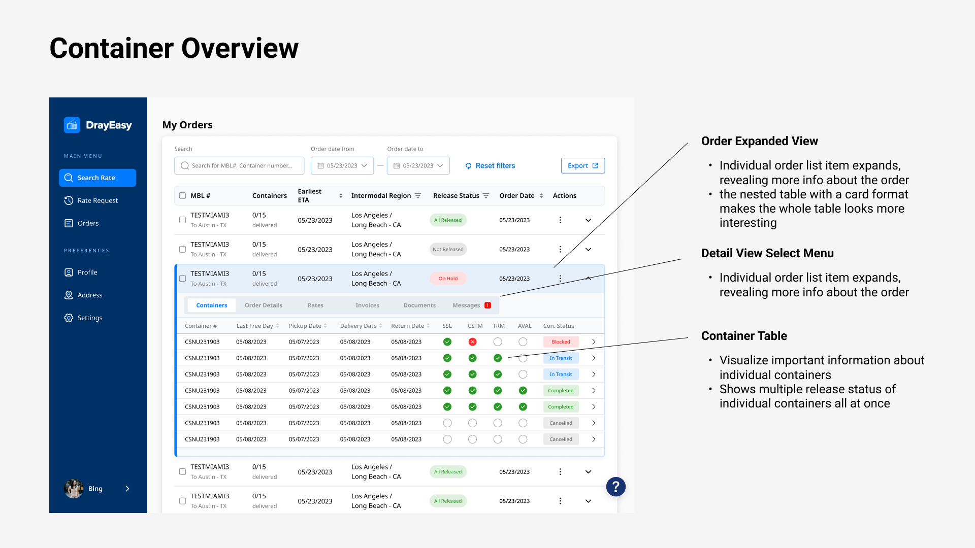
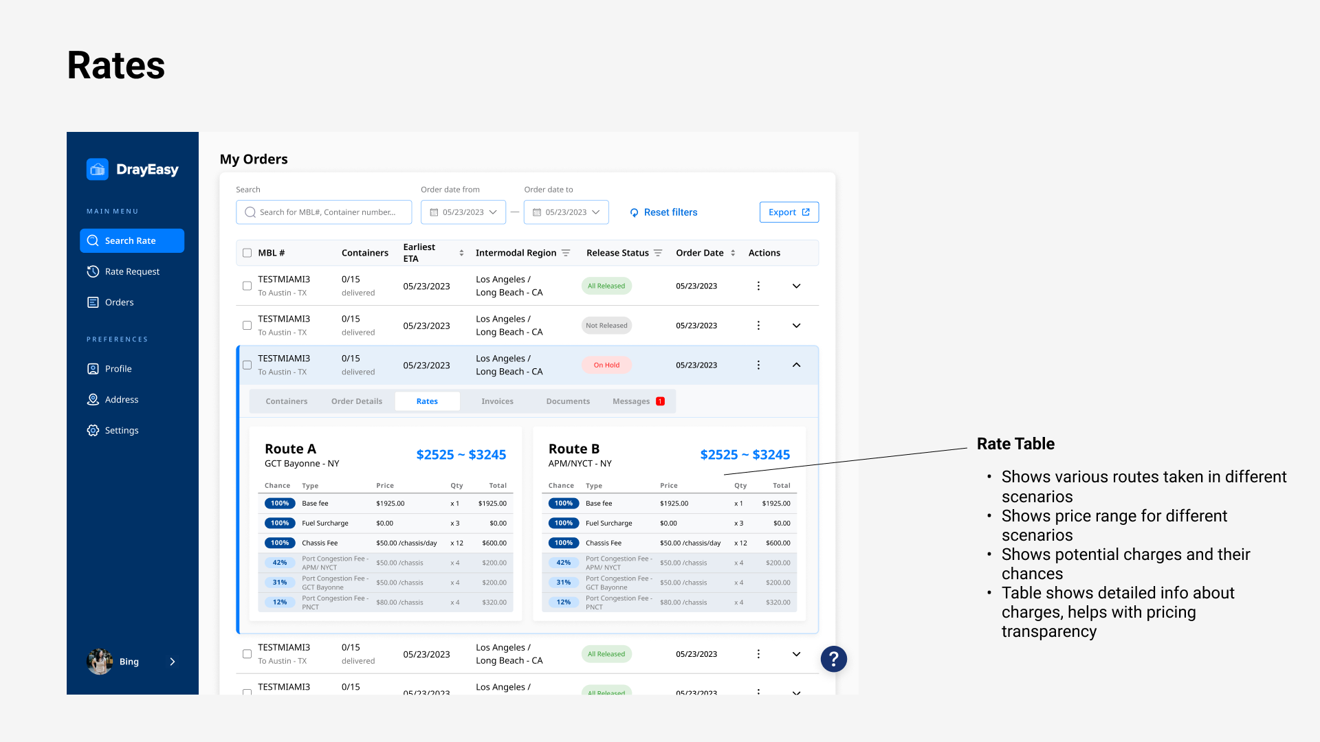
The expandable card is flexible which saves space and provides additional information at the same time.
Effecient
Insight 3

FAQs help to save time and resources for both users and customer support teams by providing quick answers.
We conducted a focus group interview with six users who have backgrounds in marketing, supply chain, freight operations, and customer service.
The “Aha!” moment struck when a forwarder agent said, “I emailed Drayeasy a lot about the updates on shipping progress and issues.” I realized there was a lack of key information. So I proposed highlighting important dates, action alerts, and adding a FAQ section. This solution significantly reduced repetitive inquiries, thereby boosting efficiency and user satisfaction.

Information Accessibility Gap


Empathize
I created a user journey map to go through the user flow, empathize with the users, and align goals among teammates. This process helped the team identify four obstacles, as well as opportunities. We decided to focus on the last two, increasing the order completion rate and improving tracking visibility.


EXPLORATION 1
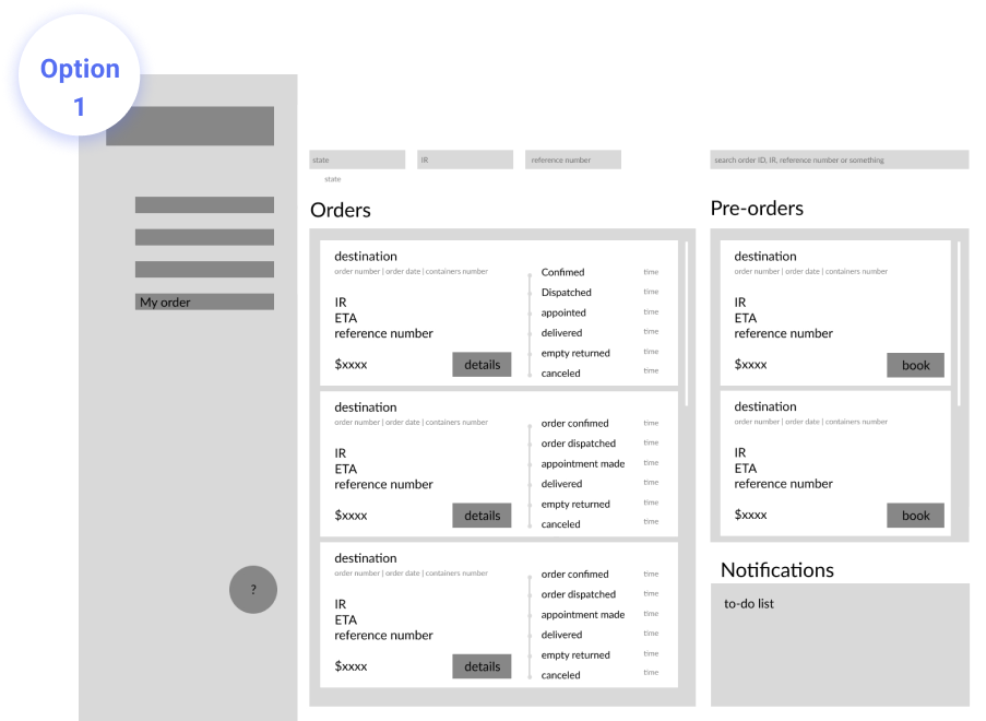
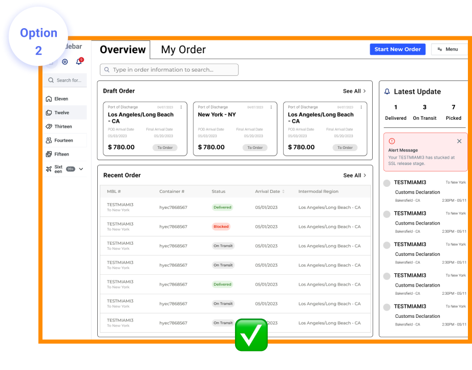
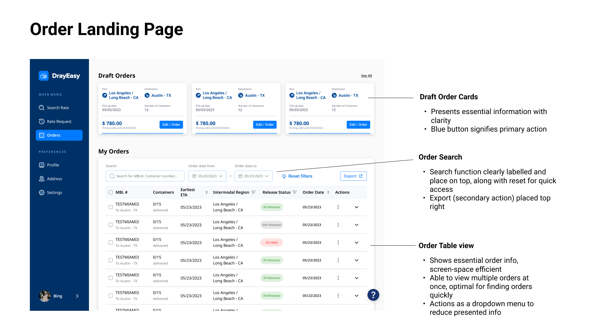
Combined “Order” and “Pre-order” Pages
Before
After
Design Process
Iteration - 2
1. Rename “pre-order” to “draft order” for better understanding.
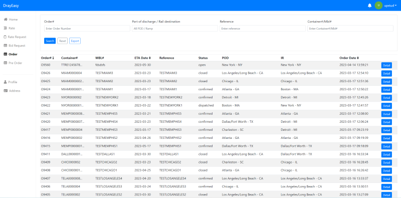
2. Table view optimized to prioritize core users' needs for efficient bulk order management.
3. Maintaining the table can reduce onboarding costs.
3. Draft orders in card design visually encourage users to complete their orders.
Iterations - 1
Combine order and pre-order in one page, card view
Pros:
1. Eliminate one page to reduce perception load for order conversion.
2. The card view is concise, clear, and consistent.
Cons:
EXPLORATION 2
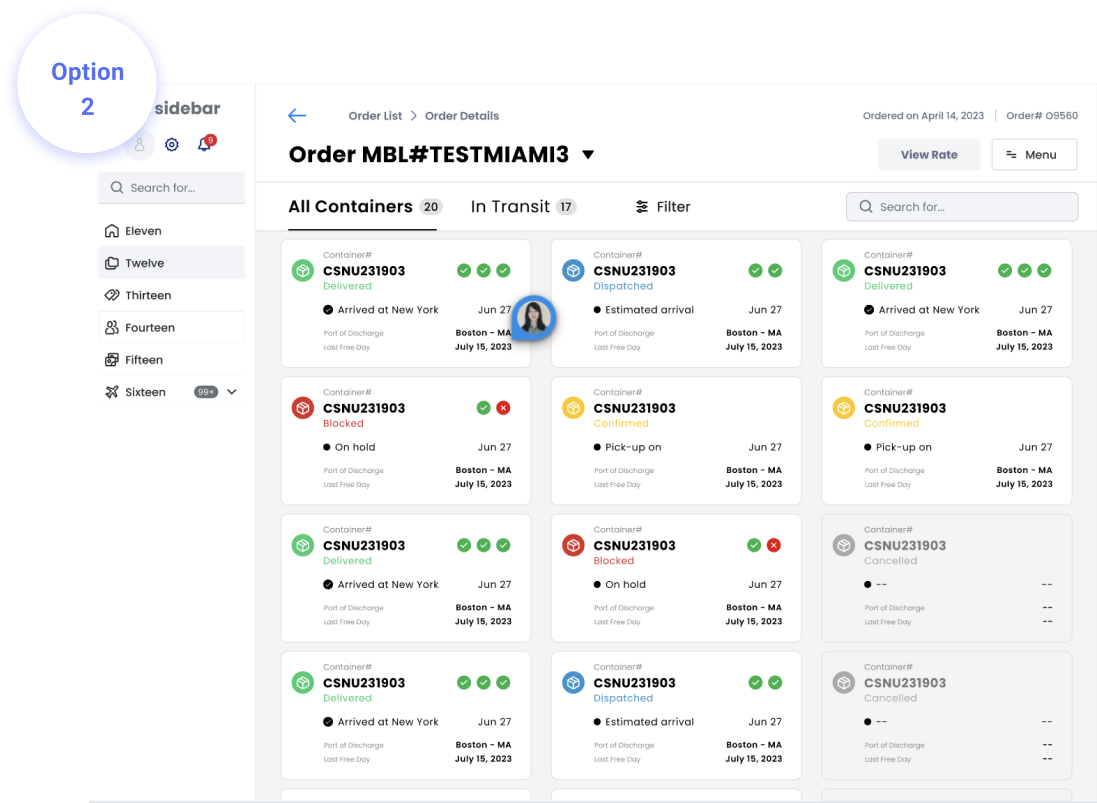
Bring Containers Upfront to the Main Level
Container View: Full-screen Panel + Container Card
Only a few orders can be displayed
Design Process
Container View: Slide-out Panel + Container Card

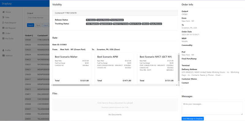
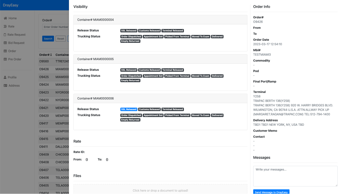
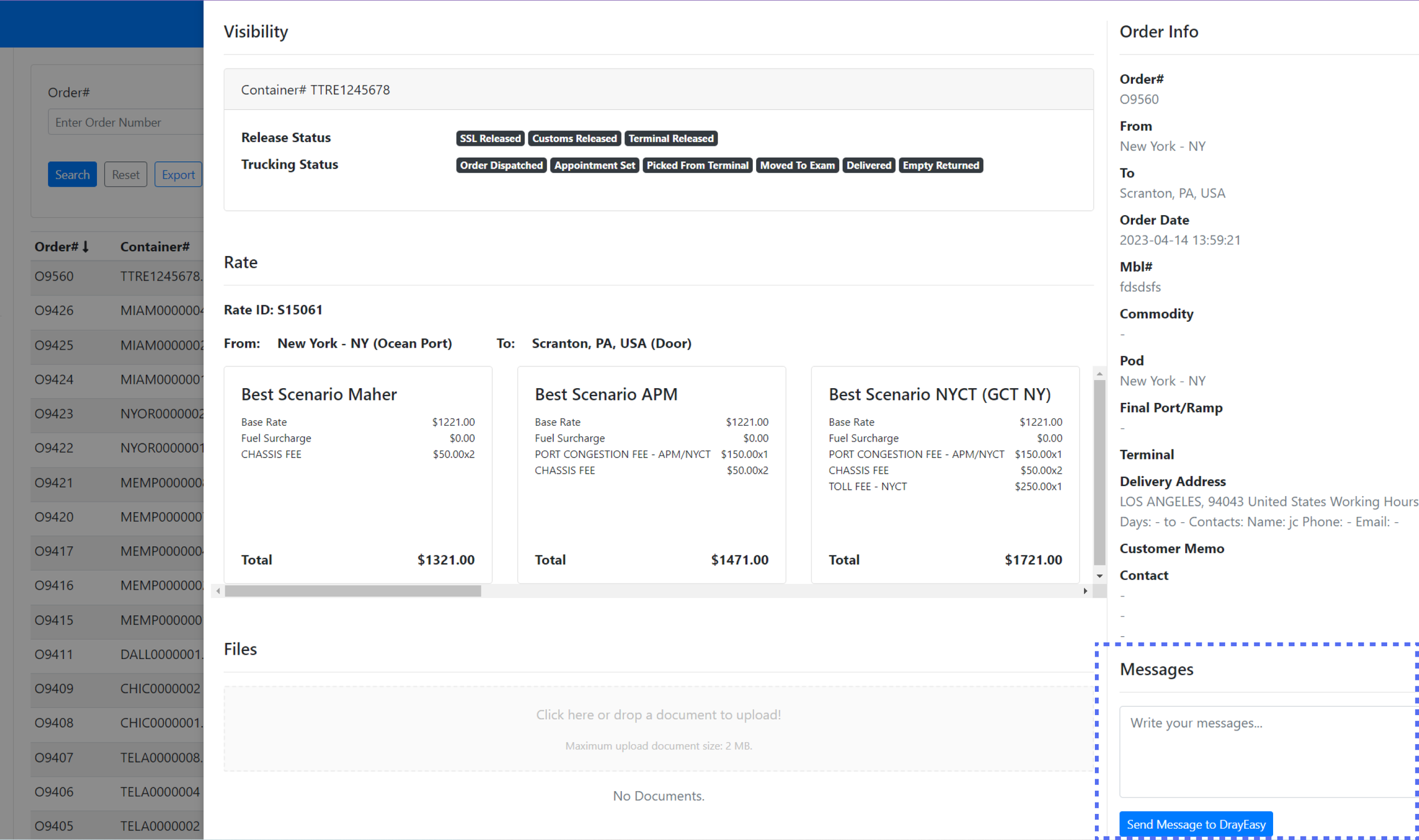
Container View: Expanded Table with More Detailed Secondary Page for Each Container

Pros:
1. Cards are more organized.
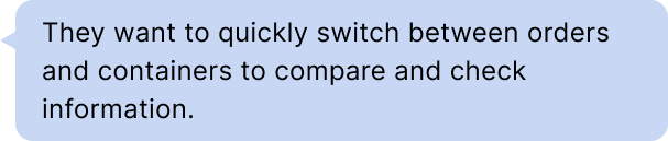
2. Slide-out panel enabled users to quickly switch between orders and containers.
Cons:
Limited space for container information.
Pros:
1. Grid cards offer benefits in terms of organization, consistency, and modularity.
2. More containers displayed.
Cons:
Users must navigate back to switch between different orders, leading to redundancy.
After
EXPLORATION 3
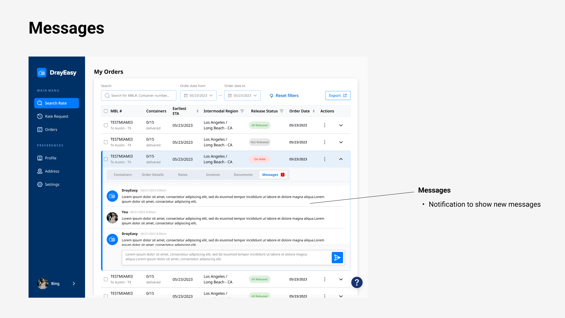
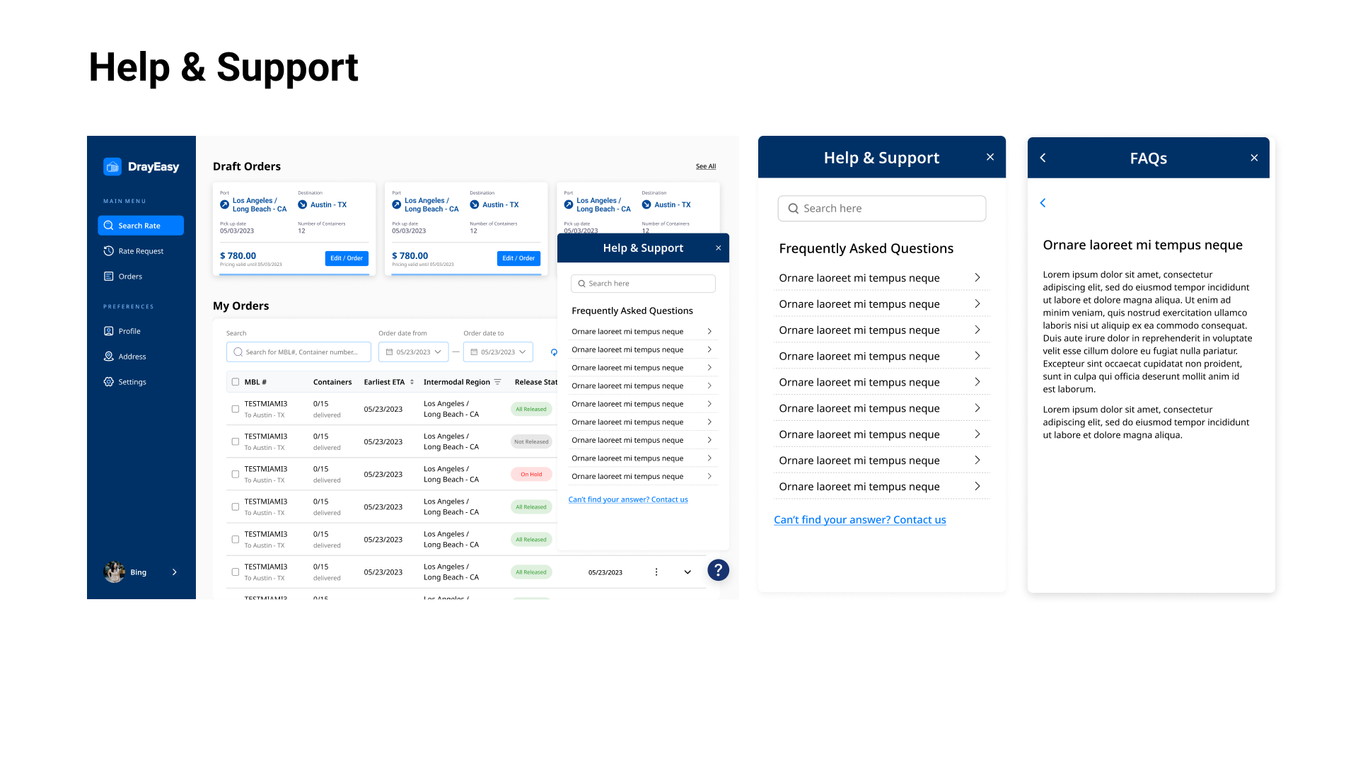
From A Hidden Message Box to Chatbox and FAQs
Before
Design Process
FAQs: Entry from Sidebar + Full-screen

Help & Support: Floating Button + Dialog

Pros:
Cons:
Users cannot view order information and ask questions simultaneously.
Pros:
1. Easier to connect the order/container and the issue both for users and Drayeasy.
2. Prepared for scalability, such as a chatbot, to meet future demand.
If I have more time
Save time both for users and Drayeasy.
FINAL DESIGN
Key Pages
REFLECTION
Takeaways
Understanding domain knowledge, including industry-specific jargon, key functionalities, and user flows, is pivotal in creating user experiences that are contextually relevant, intuitive, and efficient.

Test process to gather feedback and refine these solutions further.
Allow users to customize which order information they want to see as a summary.
Optimize for different devices and screen sizes
Before
After